Design system overhaul
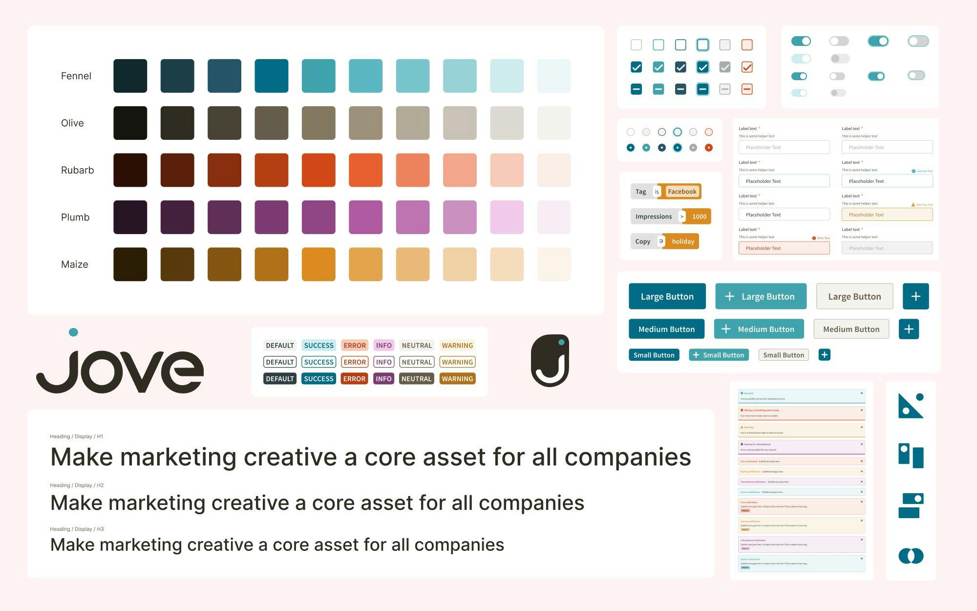
A newly launched marketing software product, Jove lacked the market differentiation and scalable style guide to attract user attention through marketing and retain users through an approachable and accessible user experience. With a variety of large projects planned to go to market, a comprehensive, rebranded, and scalable design system built in close collaboration with product, engineering, and marketing was needed to scale the business to an initial round of funding while being flexible enough to evolve rapidly over the next 12-18 months.
Strategy
The recent delivery of high-level brand primitives (logo, color palette, and fonts) acted as a baseline to build out an atomic structure for Jove's currently existing products and new products such as Creative Insights.
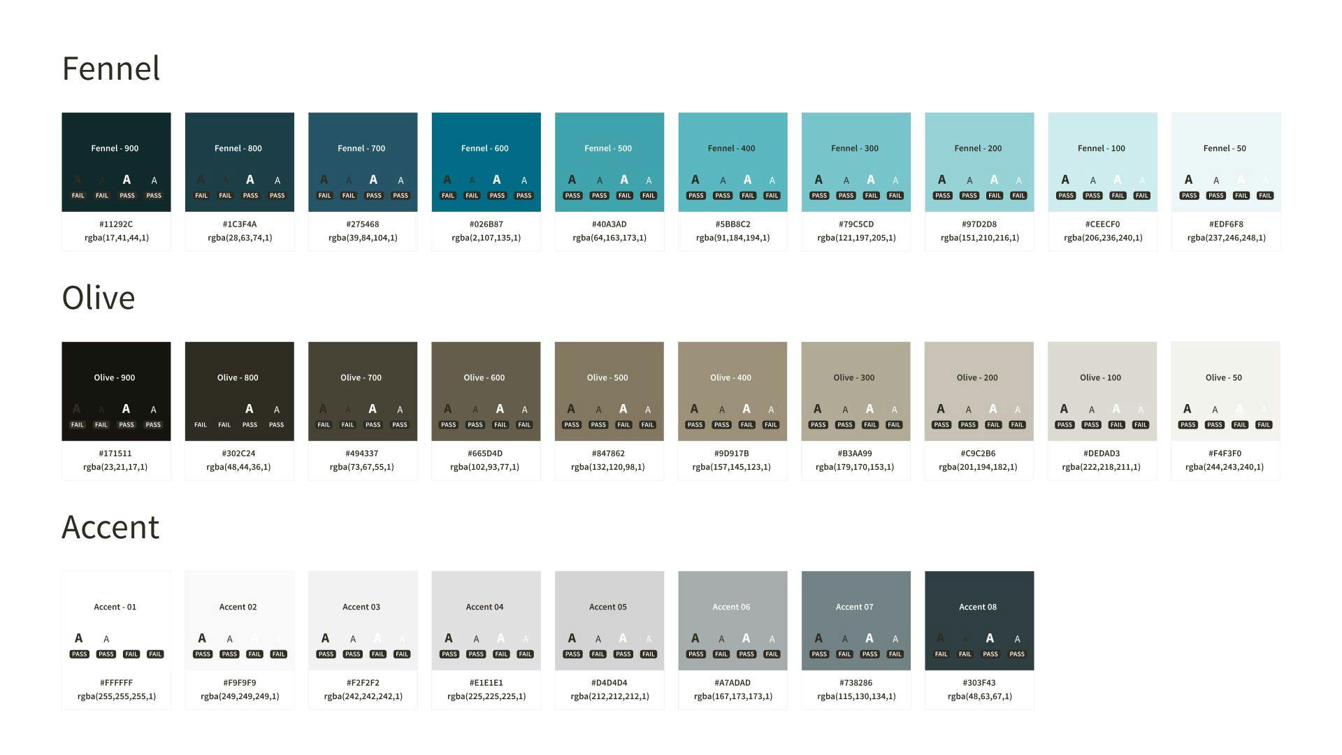
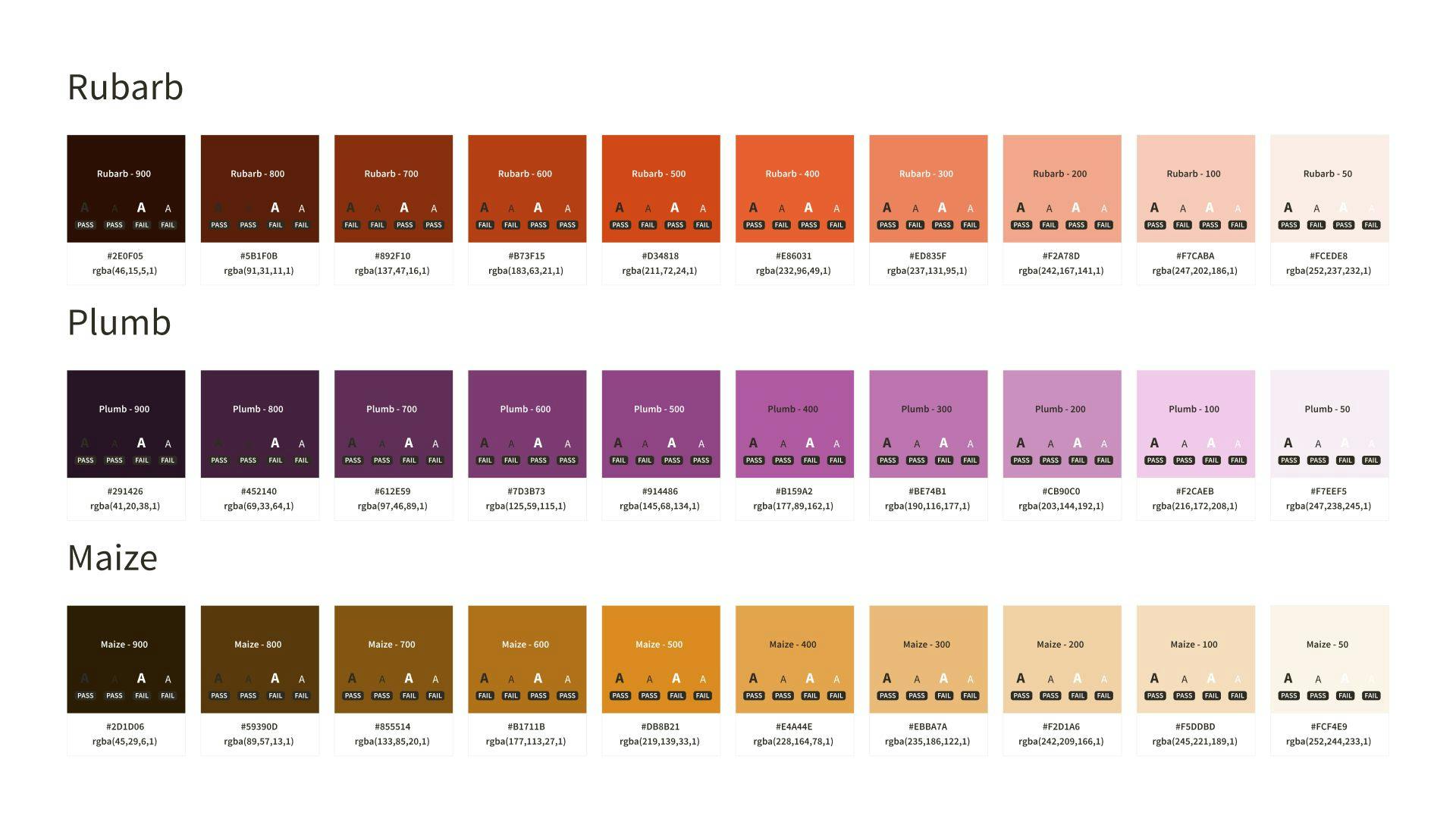
Color palette & mapping
Based on the brand primitives, we defined an accessible color system with semantic titles that easily mapped to tokens in the Jove web application and platform.
Using this system as a starting point, we mapped the legacy color system while simultaneously simplifying the interface to put more emphasis on visually stimulating ad creative.
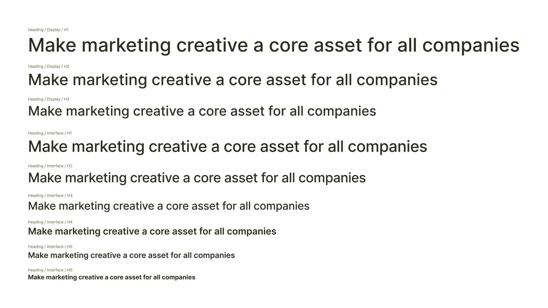
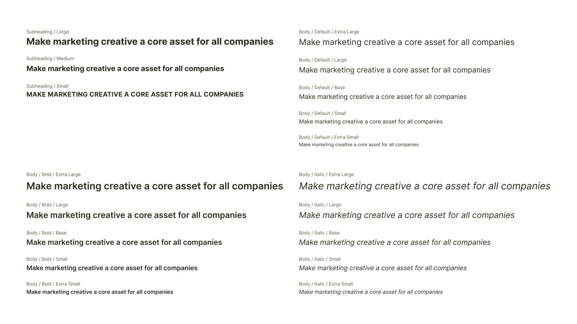
Accessible type system
Marketing data is very rich and detailed, many of the visualizations and components within Jove's products express a lot of information which is made more digestible with clear typographic hierarchy and scale.
Copy documentation
Much of a design system is focused around the individual styles and how they boil up into a broad component hierarchy. Copy and voice is often overlooked as a part of this process, but plays a vital role in guiding the user through an experience through labels, tooltips, and microcopy.
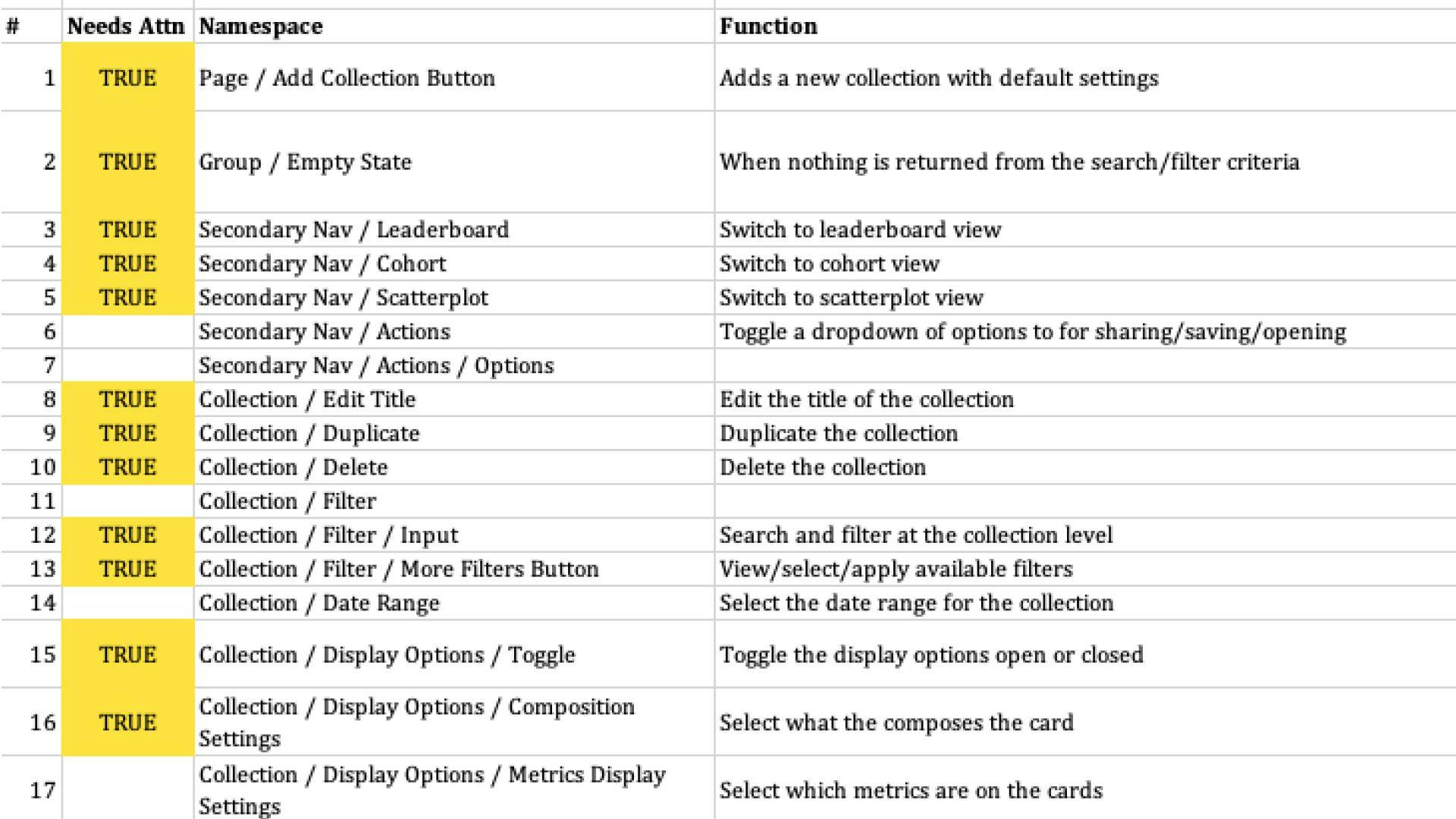
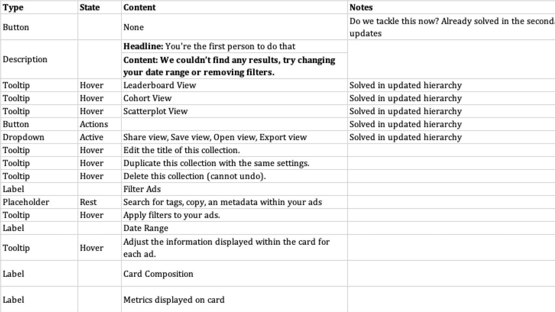
As a part of this design system refresh, we built a set of templates to document all interface copy to measure coverage, usability, tone, and streamline grammar.
- Copy elements were labeled with a namespace (what part of the interface the element was tied to), a type (button, tooltip), and what function is performed when the element is interacted with.
- If relevant, the state of the element is labeled, identifying whether it is shown on hover or when a specific action was performed.
- As a means to track updates in parallel with engineering, each element received a boolean for whether it was in the production application or not. This allowed engineers to quickly update and add new elements.
Results
- Migrating interface copy into a document (when most copy was referenced directly in Figma) increased the accessibility of everyone on our team and encouraged collaboration and updates more frequently.
- Documenting our design system in both Figma and Quip empowered engineering to integrate styles and build components in a single two-week sprint with plenty of time for user acceptance testing.
- Debuting a new brand, style guide, and design system internally helped teams understand the Jove vision and strategy to accelerate go-to-market activities.
Next steps
A design system never stops growing, this project will never finish. However, the initial project brought a variety of potential improvements to light.
- Standardizing spacing units.
- Revising lower-level atomic elements with fluidity in mind.
- Keeping up-to-date on product and design system documentation including our Storybook instance.
- The copy in error and system notifications was stored in the components directly. We plan to revise this system so that each notification is labelled with a code and mapped to a database table, making the management and updating of notifications easy.
